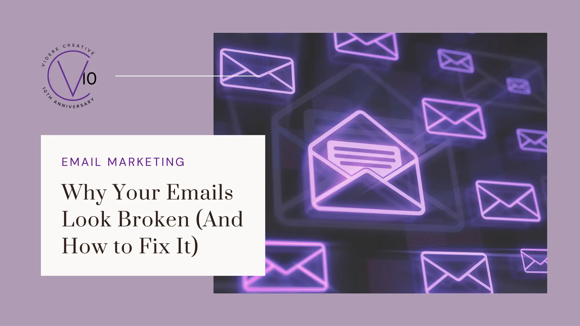

Email Rendering Best Practices for 2026
You spent substantial time writing your email. You picked the right colors, crafted a clear message, and hit send feeling good about it. Then a client mentions your logo disappeared, or a subscriber says your button was impossible to tap, or you open it on your phone and realize the whole layout collapsed.
What happened? It all comes down to email rendering.
It is one of the most overlooked aspects of email marketing, but it’s silently undermining the professionalism and performance of campaigns every single day.
In this post, we will break down why rendering issues happen, walk through the five most common mistakes, and then give you a concrete set of best practices to make sure your emails look great no matter where they land.

When you design an email, you are actually building it with four main components:
- HTML (structure) – this is the foundation and organization of your content
- CSS (styling) – this controls the colors, fonts, and overall look
- Images – any visual elements in your email
- Layout – how everything is arranged on the screen
The problem is that every inbox—Gmail, Outlook, Apple Mail, Yahoo—interprets those components a little differently. And on top of that, your email changes based on the device someone is using and whether they have dark mode turned on.
Think of it like handing the same blueprint to four different contractors. The bones are the same, but the finished result can look surprisingly different depending on who is reading it and how.
Some style elements are reliable across the board, like font size, text color, and basic spacing.
Others vary, like custom fonts, background images, and mobile adjustments. And some advanced features that work beautifully on websites, like animated effects and interactive scripts, simply do not work in email at all.
As a result, you might notice extra spacing in Outlook, slight margin differences in Gmail, text that resizes on mobile, or colors that shift dramatically in dark mode.
You are not designing for one perfect screen; you are designing for multiple realities at once.

Before we get into the fixes, it helps to know what you are up against. Here are the five mistakes that cause the most damage.
Mistake #1: Tiny Text
If your audience has to squint, they are going to move on. Small text creates friction, lowers readability, and sends an unconscious signal that you do not respect your reader’s time.
Mistake #2: Weak or Hard-to-Tap Buttons
Your call-to-action button is the most important element in your email. If it is too small, low contrast, or hard to tap on a phone, your click-through rate will drop.
Mistake #3: Overcomplicated Layouts
Multi-column designs might look polished in your email editor, but they frequently break in certain apps or shrink down to an unreadable size on mobile.
Mistake #4: Low Contrast Colors
Light gray text on a white background, or any low-contrast color combination, frustrates the average reader and becomes nearly impossible for people with visual impairments to read, especially in dark mode.
Mistake #5: Ignoring Dark Mode
Dark mode is used by millions of people and can completely transform how your email looks. White backgrounds turn dark. Dark logos blend in and disappear. Light text fades. If you have never checked your emails in dark mode, there is a real chance your carefully crafted campaign is arriving broken.

Now for the part that matters most. Here is how to address each of these issues and build a more reliable, high-performing email from the ground up.
1. Keep Your Structure Simple
Very complex layouts, too many design layers, and advanced web-style formatting are the most common causes of rendering issues. The fix is straightforward: use single-column layouts, clear content sections, and structured templates.
Some email apps like Outlook use older technology behind the scenes, which is exactly why simpler layouts are more stable across the board.
Simpler equals more reliable.
2. Make Text Easy to Read
Set body text to a minimum of 14-16px, make your headlines large enough to scan at a glance, and give your copy breathing room with proper line spacing.
Use strong contrast—dark text on a light background, or light text on a dark background—and avoid thin, light gray fonts. If you squint at your design and struggle to read it, your audience will, too.
3. Design Buttons for Thumbs, Not Mouse Clicks
Your call-to-action button should be at least 44px tall, full-width or nearly full-width on mobile so it’s easily clickable with a thumb (not just a cursor). Use clear, action-oriented language like “Watch Here,” “Reserve My Spot,” or “Get the Guide.”
High contrast, large size, and specific text are the three things that turn a button from decorative to functional.
4. Handle Images with Care
Do not rely on image-only text. Always pair images with real text so your message still lands if images are blocked. Add alt text to every image, use strong contrast, and always check how your visuals look in dark mode.
For dark mode specifically, use transparent PNG logos, avoid pure white backgrounds, and use outline or shadow techniques to keep your logo visible regardless of what background color a subscriber’s device applies.
5. Design for Scanners, Not Readers
Usually, your audience is not reading your email—they are scanning it in seconds. Every email should lead with a clear headline, supporting copy, and one obvious CTA.
Ask yourself: Is the main message visible without scrolling too far? Is there one clear primary action? If you have five CTAs, simplify to one or two.
Decision fatigue is real, and it kills clicks.
6. Treat Accessibility as a Performance Strategy
Accessible emails are not just a best practice. They improve performance, reaching more people, optimizing readability, and often increasing clicks.
Add alt text and a link to every image, use a clear heading hierarchy, and replace vague link text like “Click Here” with something descriptive, like “Download the Free Guide.” When your email works for everyone, it works better for everyone.
7. Always Preview Before You Send
Make previewing a non-negotiable part of your workflow. Use preview mode to check both desktop and mobile views, and always send a test to yourself before your campaign goes live.
And if you want to go even further, A/B testing is one of the most powerful tools available for learning what resonates with your specific audience. You can test layout, image load, CTA style, typography, padding, background color, and content density.
Small changes can have a surprisingly big impact on your results.

Email is still one of the highest-ROI marketing channels available to small businesses and solopreneurs, but only when it actually lands the way you intended.
A little extra attention to rendering, structure, and accessibility can be the difference between an email that converts and one that gets lost. The good news is that most of these fixes are simple, and once they become part of your process, they are easy to maintain.
At Videre Creative, we help service-based businesses and solopreneurs create content that looks great and gets results. If you want support building an email strategy that works from the inbox out, let’s talk about what that could look like for your business.