
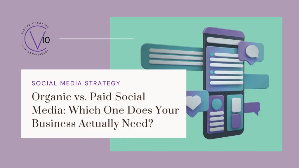
Organic vs. Paid Social Media: Which One Does Your Business Actually Need?
Quick wins and long-term growth—that’s what most businesses hope to get from social media. The catch is that those two things work on very different timelines, and chasing both without a clear strategy usually means getting neither. Understanding the difference between organic and paid social media isn’t just a marketing exercise. It’s how you make smarter decisions about where to invest your time, energy, and budget. Organic social media is everything you post without paying to promote it. Your regular feed posts, stories, reels, carousels, comments, and community engagement. It’s the day-to-day presence your brand builds on a platform over time. The strength of organic social is what it builds, not just what it reaches. Consistent, strategic content establishes credibility, deepens audience relationships, and creates a body of work that reflects who your brand actually is. When someone discovers your business and scrolls back through months of useful, relatable, or well-crafted content, that’s organic social doing its job. The timeline, though, is real. Small wins can happen early—a post that lands, a new follower who becomes a client—but meaningful growth in brand awareness and conversions typically comes after three to six months of consistent effort. Organic social is less of a faucet and more of a compounding investment. Paid social covers any content you put budget behind. Boosted posts, targeted ad campaigns, sponsored content. It lets you reach audiences beyond your existing followers and put your message in front of specific demographics, interests, and behaviors. The appeal is speed. Paid social can generate visibility and traffic faster than organic content alone, which makes it attractive when there’s a launch, a promotion, or a growth target with a tight deadline. But paid social is more nuanced than it looks. Getting sustainable results still requires testing: different messaging, different audiences, different formats. The early weeks of a paid campaign are often as much about learning as they are about converting. And there’s one fundamental limitation worth understanding: the moment the budget stops, so does the reach. Paid social doesn’t leave anything behind. Organic and paid social are often talked about as if they’re competing options. In practice, they serve different functions, and the relationship between them matters. Paid without organic: Driving traffic to a profile or page that has little content, low engagement, or an inconsistent presence creates a credibility gap. People click through, look around, and leave. The ad did its job; the brand didn’t. Organic without paid: Growth is slower, but it builds something durable. A strong organic presence compounds over time. Content gets shared, accounts get recommended, and audiences grow because the content is genuinely worth following. For many small businesses and solopreneurs, organic alone is a completely viable long-term strategy. Both together: When organic and paid are aligned—same brand voice, same strategic pillars, complementary content—they amplify each other. Paid brings in new eyes; organic gives those people a reason to stay. This combination makes the most sense when there’s a clear strategy behind both, not just a budget available to spend. There’s no universal answer, but these questions can help you think it through: What’s your timeline? If there’s a specific event, launch, or window driving your goals, paid social can accelerate visibility. If you’re building for the long term, organic is where the foundation gets laid. What’s your budget—and what’s your bandwidth? Paid social requires ongoing financial investment. Organic social requires consistent time and creative effort. Both have real costs; they’re just different kinds. What are you actually trying to accomplish? Brand awareness, community building, and trust are organic’s strengths. Immediate traffic and targeted reach are where paid shines. Knowing which outcome matters most right now shapes the decision. What does your current presence look like? A brand with no established content or community will get less from paid social than one that already has a credible organic footprint to send people to. Many businesses thrive on organic social alone. Others use paid strategically to accelerate specific goals while maintaining a strong organic foundation. The right answer isn’t about budget size, it’s about strategy. Whether the approach is organic, paid, or a combination of both, the businesses that see real, lasting results from social media share three things: A clear strategy Consistent execution The patience to let it work Quick wins are possible. But sustainable ROI—the kind that builds a recognizable brand, a loyal audience, and reliable revenue—doesn’t come from tactics alone. It comes from knowing why you’re showing up, showing up consistently, and giving your efforts enough time to compound. That’s true whether you’re running ads or not. The organic vs. paid question is really a strategy question in disguise. The platform, the format, and the budget all matter less than having a clear plan behind them. Videre Creative helps service-based businesses and solopreneurs build strategic, consistent social media presences that actually connect with the right audience. If you’re ready to stop guessing and start growing, let’s talk about what a focused social media strategy could look like for your business.
Why Your Emails Look Broken (and How to Fix It)

Email Rendering Best Practices for 2026 You spent substantial time writing your email. You picked the right colors, crafted a clear message, and hit send feeling good about it. Then a client mentions your logo disappeared, or a subscriber says your button was impossible to tap, or you open it on your phone and realize the whole layout collapsed. What happened? It all comes down to email rendering. It is one of the most overlooked aspects of email marketing, but it’s silently undermining the professionalism and performance of campaigns every single day. In this post, we will break down why rendering issues happen, walk through the five most common mistakes, and then give you a concrete set of best practices to make sure your emails look great no matter where they land. When you design an email, you are actually building it with four main components: HTML (structure) – this is the foundation and organization of your content CSS (styling) – this controls the colors, fonts, and overall look Images – any visual elements in your email Layout – how everything is arranged on the screen The problem is that every inbox—Gmail, Outlook, Apple Mail, Yahoo—interprets those components a little differently. And on top of that, your email changes based on the device someone is using and whether they have dark mode turned on. Think of it like handing the same blueprint to four different contractors. The bones are the same, but the finished result can look surprisingly different depending on who is reading it and how. Some style elements are reliable across the board, like font size, text color, and basic spacing. Others vary, like custom fonts, background images, and mobile adjustments. And some advanced features that work beautifully on websites, like animated effects and interactive scripts, simply do not work in email at all. As a result, you might notice extra spacing in Outlook, slight margin differences in Gmail, text that resizes on mobile, or colors that shift dramatically in dark mode. You are not designing for one perfect screen; you are designing for multiple realities at once. Before we get into the fixes, it helps to know what you are up against. Here are the five mistakes that cause the most damage. Mistake #1: Tiny Text If your audience has to squint, they are going to move on. Small text creates friction, lowers readability, and sends an unconscious signal that you do not respect your reader’s time. Mistake #2: Weak or Hard-to-Tap Buttons Your call-to-action button is the most important element in your email. If it is too small, low contrast, or hard to tap on a phone, your click-through rate will drop. Mistake #3: Overcomplicated Layouts Multi-column designs might look polished in your email editor, but they frequently break in certain apps or shrink down to an unreadable size on mobile. Mistake #4: Low Contrast Colors Light gray text on a white background, or any low-contrast color combination, frustrates the average reader and becomes nearly impossible for people with visual impairments to read, especially in dark mode. Mistake #5: Ignoring Dark Mode Dark mode is used by millions of people and can completely transform how your email looks. White backgrounds turn dark. Dark logos blend in and disappear. Light text fades. If you have never checked your emails in dark mode, there is a real chance your carefully crafted campaign is arriving broken. Now for the part that matters most. Here is how to address each of these issues and build a more reliable, high-performing email from the ground up. 1. Keep Your Structure Simple Very complex layouts, too many design layers, and advanced web-style formatting are the most common causes of rendering issues. The fix is straightforward: use single-column layouts, clear content sections, and structured templates. Some email apps like Outlook use older technology behind the scenes, which is exactly why simpler layouts are more stable across the board. Simpler equals more reliable. 2. Make Text Easy to Read Set body text to a minimum of 14-16px, make your headlines large enough to scan at a glance, and give your copy breathing room with proper line spacing. Use strong contrast—dark text on a light background, or light text on a dark background—and avoid thin, light gray fonts. If you squint at your design and struggle to read it, your audience will, too. 3. Design Buttons for Thumbs, Not Mouse Clicks Your call-to-action button should be at least 44px tall, full-width or nearly full-width on mobile so it’s easily clickable with a thumb (not just a cursor). Use clear, action-oriented language like “Watch Here,” “Reserve My Spot,” or “Get the Guide.” High contrast, large size, and specific text are the three things that turn a button from decorative to functional. 4. Handle Images with Care Do not rely on image-only text. Always pair images with real text so your message still lands if images are blocked. Add alt text to every image, use strong contrast, and always check how your visuals look in dark mode. For dark mode specifically, use transparent PNG logos, avoid pure white backgrounds, and use outline or shadow techniques to keep your logo visible regardless of what background color a subscriber’s device applies. 5. Design for Scanners, Not Readers Usually, your audience is not reading your email—they are scanning it in seconds. Every email should lead with a clear headline, supporting copy, and one obvious CTA. Ask yourself: Is the main message visible without scrolling too far? Is there one clear primary action? If you have five CTAs, simplify to one or two. Decision fatigue is real, and it kills clicks. 6. Treat Accessibility as a Performance Strategy Accessible emails are not just a best practice. They improve performance, reaching more people, optimizing readability, and often increasing clicks. Add alt text and a link to every image, use a clear heading hierarchy, and replace vague link text like “Click
The Secrets of Good Storytelling

Your Best Story Is Already Hiding in Plain Sight You have probably sat through a presentation, scrolled past a brand post, or read an email that was technically fine (correct, professional, well-formatted), but felt absolutely nothing. No pull. No reason to keep reading. No memory of it an hour later. That’s what happens when information shows up without a story. Storytelling is not a nice-to-have soft skill. It is the core of every piece of marketing that has ever worked. Your ability to explain why something matters is what determines whether people tune in or tune out. The good news is, you already have everything you need to do it well. Here is the myth worth busting first: storytelling is for charismatic TEDx speakers, novelists, movie directors, and brand strategists with a thesaurus. It is not for the rest of us. That is simply not true. Your storytelling power does not come from a polished personal brand or a dramatic origin story. It comes from your observations, your language, and your lived experience. Some of the best stories come from the things you notice, struggle with, or say out loud without realizing they are profound. Stories you tell in passing, without hesitation, at a casual lunch. Your most powerful story might be hiding in plain sight. And that story does not need a dramatic backstory or a tidy arc to work; it just needs to be real. If you have ever Googled “storytelling framework,” you’ve probably encountered the hero’s journey, the three-act structure, the problem-agitate-solution format, and about a dozen variations. These frameworks exist for a reason: they give shape to ideas that might otherwise wander. However, real storytelling does not come from a fill-in-the-blanks worksheet. When you lean too heavily on a formulaic structure, your story ends up sounding like everyone else’s. The framework becomes a cage instead of a scaffold. Use structure as a starting point, not a finish line. Let it guide you into the story, then trust yourself enough to go off-script. If you are still pouring most of your energy into long-form, highly produced content, it might be time to reconsider. According to a 2025 report from SundaySky, short-form videos under one minute have an average engagement rate of 50%, significantly outperforming other video formats—and prompting brands to prioritize micro content in their strategies. This is not an argument against depth or quality; it’s an argument for meeting your audience where they are. A 45-second video that gets to the emotional core of your story will outperform a polished 10-minute production that takes three minutes to get interesting. Short does not mean shallow. It means intentional. Marketing strategy should be about more than just “do this to get these people.” When your content feels disconnected from your why, or even a little icky, it might be time to reconnect with the story behind the numbers. If you feel inspired by what you are saying, other people will too. Culture-first brands like Nike or Topicals, the skincare brand built around people with real skin conditions, understand this deeply. They are not just selling products; they are built around stories and experiences that resonate with a defined cultural group. As creative strategist, Cristina Jerome (formerly of Topicals), explains: “You can’t have culture-first marketing without a founder or brand story that aligns with the culture you’re trying to speak to. Without that alignment, the marketing feels performative.” If you don’t have a founder whose story naturally connects to the community you want to reach, Jerome recommends building genuine relationships with ambassadors from that community and letting those partnerships inform your strategy and storytelling from the ground up. When storytelling becomes a daily habit rather than an afterthought, you build consistency, connection, and credibility. That is how trust compounds. Here are three practical ways to start: Start a story bank. Use a shared doc or spreadsheet to log every quote, stat, or image that made someone smile, pause, or share. Tag it by theme and use it when you need content fast. Use AI. Have an AI tool rewrite existing content as a one-paragraph story that highlights emotion, purpose, and impact. Use it as a spark, not a finished product. Lean on visuals. A carousel is more than a photo dump; it’s a high-performing format used to explain, educate, and/or entertain. Pair strong visuals with a clear narrative thread and you have something people will actually stick around for. Here is the formula that actually works: emotion + logic = engagement. To find a point of genuine connection, ask yourself: What did you feel? What did you see? What did you hear? Let that guide your opening. Don’t underestimate humor! If you can get your audience to laugh, you have already bypassed the part of the brain that says, “I don’t trust this.” Once you have that emotional hook, support it with something logical, like a data point, a proof point, something that solidifies the emotion so the brain can hold onto it. The more stories you share, the more context and nuance you give your audience. They can fill in the gaps about who you are with accurate information, rather than something they saw online or read in a book 10 years ago. Use narrative to fill in the picture of who you are, what your product or service does, the value you bring, and how that connects to the real humans in your community. That is the beauty of storytelling: when you share who you are, your audience will want to be part of it with you. You don’t need a dramatic backstory, a massive production budget, or a perfectly crafted brand voice to tell stories that move people. You need honesty, a little structure, and the willingness to share what you actually think and feel. At Videre Creative, we help service-based businesses and solopreneurs find their story and build content that actually connects. If you are ready to make storytelling a real part of your
Build a Marketing Plan You Won’t Ghost By February

Inspired by Jason Lyman’s approach (Microsoft, Dropbox, Customer.io), adapted for the “I wear every hat in this business” crowd Have you ever built a beautiful, color-coded, Pinterest-worthy annual marketing plan… only to abandon it by mid-February like a forgotten gym membership? You are not alone. Most annual plans fade early. A surprise in Q1 shows up, the market shifts, priorities change, or you simply realize that Past You was a little too optimistic about Future You’s energy and calendar. Jason Lyman, CMO of Customer.io, takes a different approach. And it works whether you’ve got a big team or just you, your laptop, and an emotional support iced coffee. Here are Jason’s five steps, translated into solopreneur-speak. Your marketing strategy should be connected to the broader company strategy. In other words, you cannot pick tactics until you know what the whole business is actually trying to do next year. Too many solopreneurs start with a list of actions: “I’m going to post on social every day!” “I’m launching a podcast!” “I’m buying ads and hoping for the best!” But if those things don’t point directly toward your business goals, you have a plan held together by vibes instead of strategy. Before you plan ANYTHING, ask yourself: What are my top 3 business goals this year? Where am I investing my time and money? What is keeping me (the CEO, COO, CMO, and intern) awake at night? Your marketing plan should answer those things, not distract from them. Step to start: Before opening a Google Doc, spend 30 minutes answering this: what are three things you could achieve next year that would change the game for your business? Your marketing exists to serve those outcomes. The Play to Win framework helps connect strategy to resourcing. Answer these five questions, in order, to give yourself structure, direction, and clear reasoning for every decision. 1. What is your winning aspiration? This should be specific and measurable. Instead of “get more clients,” try “become the go-to designer for eco-friendly brands.” 2. Where will you play? Who exactly are you selling to, and where do they hang out? “Everyone” is not a target audience. Get specific about industry, stage of business, and platforms. 3. How will you win? These are your three to five big strategic content pillars. They serve as the core themes that keep your message focused, your content consistent, and your marketing aligned with what your audience actually cares about. For example: Build authority through short-form video Launch a productized service Grow partnerships with complementary creators 4. What capabilities must be in place? What do you need to do or have to make those pillars real? That might look like a consistent content calendar, a simple CRM, a virtual assistant, or even just protected deep work time. 5. What systems are required? Think tools, budget, and workflow. The goal is not to overcomplicate things, but to be intentional. The big payoff is that your marketing plan becomes a map, rather than a pile of tasks. Step to start: Choose one clear winning aspiration and draft your three to five content pillars that support it. Then identify one capability and one system you need to put in place to make those pillars achievable. Healthy marketing plans balance high confidence work with experimental bets. Solopreneurs tend to land on one of two extremes: (A) They repeat whatever worked last year and never try anything new, or (B) they make massive, terrifying bets that would require superhuman output to sustain. Instead, split your energy like this: 70%: High Confidence (your money-makers). These are the channels and offers that reliably work, such as your email list, referrals, a signature service, or a consistent content pillar. 20%: Medium Confidence (smart tests). These are structured experiments. Maybe they work; maybe they don’t. Think webinars or workshops, a small paid ad test, or finally trying short-form video in a consistent way. 10%: Game Changers (moonshots). These are your big, potentially transformative bets, like launching a SaaS, creating a high-level course, or building a brand new product line. Do NOT pour everything into the 10%. That’s how business owners end up tired, broke, and stressed. The goal is to expand and evolve without putting the entire business at risk. Step to start: Audit your current and planned marketing activities, then categorize each one into 70, 20, or 10. If everything lands in the 70% bucket, add a few thoughtful experiments. If everything belongs in the 10% bucket, scale back until the basics are covered. Keep your strategic pillars consistent but let the tactics flex. Entrepreneurs need this tattooed somewhere visible. Your plan isn’t supposed to be rigid. Rigid things eventually break. Your strategic pillars (your three to five big bets from Step 2) stay consistent throughout the year. Everything else—your specific tactics, campaigns, and platform use—can move around. Here’s a practical planning structure for solopreneurs: Annual: Define your strategic pillars. Quarterly: Review your progress, run experiments, and adjust non-pillar tactics. Monthly: Create your specific tactical plan (what gets posted when). Weekly: Focus on executing your workflow. It also helps to separate your KPIs (Key Performance Indicators), which are nonnegotiable goals like revenue, lead volume, and subscribers, from your OKRs (Objectives and Key Results), which are stretch goals like launching a new offer or testing a new channel. This separation allows you to adjust your tactics on the fly without losing sight of your core financial targets. Step to start: Create your annual, quarterly, monthly, and weekly planning structure in a single document or dashboard. Add recurring review dates to your calendar so adjustments become part of your system instead of something you only do when things feel off-track. Anchor your plan around what you want to complete in the first month. Many entrepreneurs ease into January slowly, and that gentle start often lingers much longer than intended. The result is a year that feels reactive